[포스코x코딩온] CSS-Position, Stack order, 배경, Display
CSS 요소
Position
- static: 정적 위치 지정 방식(position의 기본 속성)
- relative: 상대 위치 지정 방식(요소 자신을 기준으로 배치)(상대적으로 위치 정한다.)
- absolute:절대 위치 지정 방식(위치상 부모 요소를 기준으로 배치한다.)
- fixed: 고정 위치 지정 방식(뷰포트를 기준으로 배치한다.)
<body>
    <div class="box">
      <div class="item1"></div>
      <div class="item2"></div>
      <div class="item3"></div>
    </div>
  </body>
<!DOCTYPE html>
<html lang="en">
<head>
<meta charset="UTF-8" />
<meta name="viewport" content="width=device-width, initial-scale=1.0" />
<title>Document</title>
<style>
/* static(정적으로 고정됨)이 position의 기본 속성
relative는 상대적으로 위치 정하는 것.
absolute는 컨테이너에(스크롤으로 이동하면 안보임.) 기준으로 정해짐.
fixed는 (스크롤로 내려도 고정되서 따라옴) 브라우저(뷰포트)에 고정됨*/
div {
width: 100px;
height: 100px;
}
.box {
width: 500px;
height: 500px;
background-color: bisque;
position: relative;
}
.item1 {
background-color: blueviolet;
position: relative;
left: 50px;
top: 30px;
}
/* absolute는 부모가 relative position일때 부모를 기준으로 잡는다. */
.item2 {
background-color: yellow;
position: absolute;
right: 30px;
bottom: 100px;
}
.item3 {
background-color: skyblue;
position: fixed;
top: 100px;
right: 100px;
}
</style>
</head>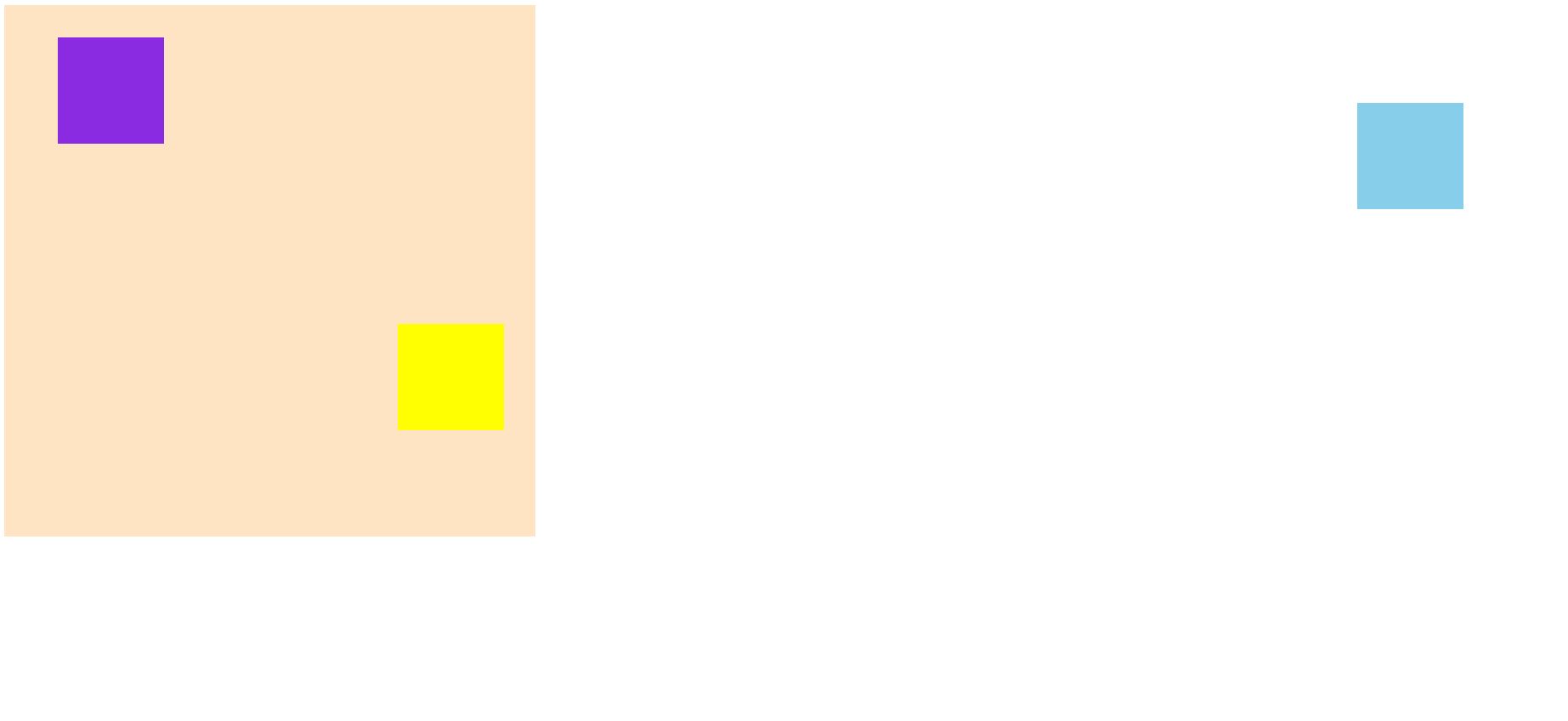
요소 쌓임 순서(Stack order)
- 요소에 position 속성의 값이 있는 경우 위에 쌓인다.(기본값 static인 경우에는 제외된다.)
- 1번 조건이 같은 경우, z-index 속성의 숫자 값이 높은 순으로 위에 쌓인다.(기본값은 0)
- 1번과 2번 조건까지 같으면 HTML의 다음 구조일수록 위에 쌓인다.
- z-index: auto:부모 요소와 동일한 쌓임 정도 / 숫자: 숫자가 높을수록 위에 쌓임
<body>
    <div class="container">
      container
      <div class="item1">item1</div>
      <div class="item2">item2</div>
      <div class="item3">item3</div>
    </div>
  </body>
<style>
.container {
position: relative;
width: 500px;
height: 500px;
background-color: blueviolet;
}
.item1 {
position: absolute;
width: 100px;
height: 100px;
z-index: 3;
background-color: antiquewhite;
}
.item2 {
position: absolute;
width: 100px;
height: 100px;
top: 30px;
left: 30px;
z-index: 1;
background-color: blue;
}
.item3 {
position: absolute;
width: 100px;
height: 100px;
top: 60px;
left: 60px;
z-index: 2;
background-color: aquamarine;
}
</style>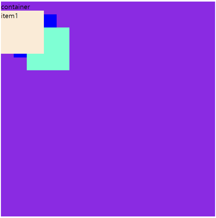
★z-index을 활용한 지렁이 만들기
  <body>
    <div>
      <div class="circle circle1"></div>
      <div class="circle circle2"></div>
      <div class="circle circle3"></div>
      <div class="circle circle4"></div>
      <div class="circle circle5"></div>
      <div class="circle eye1"></div>
      <div class="circle eye2"></div>
      <img src="/pngwing.com.png" alt="grass" class="grass" />
    </div>
  </body>
<style>
.circle {
width: 50px;
height: 50px;
background-color: rgb(84, 204, 255);
border-radius: 50%;
position: absolute;
}
.circle2 {
top: 20px;
left: 40px;
background-color: rgb(97, 97, 255);
}
.circle3 {
top: 40px;
left: 70px;
background-color: rgb(79, 25, 255);
}
.circle4 {
top: 35px;
left: 90px;
background-color: rgb(152, 209, 255);
}
.circle5 {
top: 31px;
left: 110px;
z-index: 11;
}
.eye1 {
width: 25px;
height: 25px;
border-radius: 50%;
background-color: white;
top: 15px;
left: 15px;
}
.eye2 {
width: 10px;
height: 10px;
border-radius: 50%;
background-color: black;
top: 20px;
left: 15px;
}
.grass {
position: relative;
width: 150px;
height: 50px;
top: 42px;
left: 5px;
z-index: 10;
}
</style>
z-index를 활용하면 이런 지렁이 만들 수 있습니다~~~~
배경
- background-color: transparent(투명) / 색상(지정 가능)
- background-image: none(이미지 없음) / url(경로)
- background-repeat: repeat(이미지 수직,수평 반복) / repeat-x(X축 반복) / repeat-y(Y축 반복) / no-repeat(반복 없음)
- background-position: 방향, 단위 지정 가능
- background-size: auto(이미지 실제 크기) / 단위 / cover(더 넓은 너비에 크기를 맞춤) / contain(더 짧은 너비에 크기를 맞춤)
- background-attachment: scroll(이미지가 요소 따라서 같이 스크롤, 즉, 우리 눈에는 변화가 없다.) / local(스크롤하면 이미지도 같이 움직임) / fixed(뷰포트에 고정되어 같이 스크롤이 안된다.)
  <body>
    <div class="back sky1"></div>
    <div class="back sky2"></div>
    <div class="back sky3"></div>
  </body>
<style>
.back {
width: 800px;
height: 500px;
background-color: skyblue;
background-image: url(https://item.kakaocdn.net/do/d84248170c2c52303db27306a00fb861f604e7b0e6900f9ac53a43965300eb9a);
}
.sky1 {
background-position: center;
background-repeat: repeat-x;
}
.sky2 {
background-size: contain;
background-position: 100px 30px;
background-repeat: no-repeat;
}
.sky3 {
background-size: cover;
background-position: 50px;
background-repeat: no-repeat;
}
</style>
sky1은 repeat-x로 x축을 기준으로 반복되어 나타나며, sky2은 contain과 no-repeat으로 짧은 너비인 세로에 따라 반복되지 않게 나타난다. sky3은 cover와 no-repeat으로 넓은 너비인 가
로에 따라 반복되지 않게 나타난다.
Display
- Flex: 부모의 크기에 맞추어 나열 되는 것을 의미한다.
- flex-direction: 주 축을 설정하는 것으로 row(행 축으로 좌->우) / row-reverse(행 축으로 우->좌) / column(열 축으로 위 ->아래) / column-reverse(열 축으로 아래->위)
- flex-wrap: flex items 줄 바꿈 여부를 나타냄 / nowrap(줄 바꿈 없음) / wrap(여러 줄로 묶음) / wrap-reverse(wrap의 반대 방향으로 묶음) => 그냥 flex로 하면 부모 크기에 맞춰서 자식 요소의 크기가 변하여서 한 줄로 나타나는데 wrap을 사용하면 줄을 바꾸면서 자식의 크기를 유지시킨다.
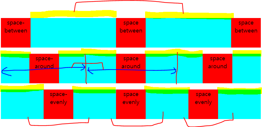
- justify-content: 주 축의 정렬 방법 / 열을 의미(column일때는 행) / flex-start(flex items를 시작점으로 정렬) / flex-end(flex items를 끝점으로 정렬) / center(flex items를 가운데 정렬) / space-between(각 flex item 사이를 균등하게 정렬) / space-around(각 flex item의 외부 여백을 균등하게 정렬) / space-evenly
- flex-flow: flex-direction + flex-wrap 합친 속성
- order: 요소들에서 순서를 정렬하기 위해 사용하는 것으로 작은 값이 앞으로 정렬
- align-self: align을 자기 자신만 사용
- align-items: 교차 축의 한 줄 정렬 방법 / 행을 의미(column일 경우에는 열) / stretch(flex items를 교차 축으로 늘림) / flex-start(flex items를 각 줄의 시작점으로 정렬) / flex-end(flex items를 각 줄의 끝점으로 정렬) / center(flex items를 각 줄의 가운데 정렬) / baseline(flex items를 각 줄의 문자 기준선에 정렬)
- align-content: 교차 축의 여러 줄 정렬 방법 / stretch(flex items를 시작점으로 정렬) / flex-start(flex items를 시작점으로 정렬) / flex-end(flex items를 끝점으로 정렬) / center(flex items를 가운데 정렬) / space-between(각 flex item 사이를 균등하게 정렬) / space-around(각 flex item의 외부 여백을 균등하게 정렬)
Flexbox를 통해 여러가지 만들어 보기
<!-- @format -->
<!DOCTYPE html>
<html lang="ko">
<head>
<meta charset="UTF-8" />
<meta http-equiv="X-UA-Compatible" content="IE=edge" />
<meta name="viewport" content="width=device-width, initial-scale=1.0" />
<title>Flexbox 마스터1</title>
<link rel="stylesheet" href="./practice7.css" />
<style>
h4 {
text-align: center;
background-color: pink;
color: aliceblue;
}
</style>
</head>
<body>
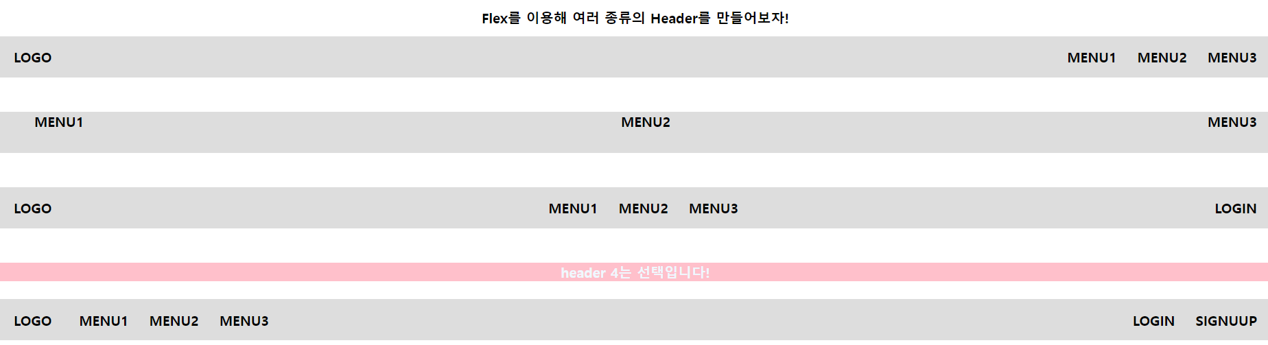
<h1>Flex를 이용해 여러 종류의 Header를 만들어보자!</h1>
<!-- header1 -->
<header class="header1">
<span>LOGO</span>
<ul class="menus">
<li>MENU1</li>
<li>MENU2</li>
<li>MENU3</li>
</ul>
</header>
<!-- header2 -->
<header class="header2">
<ul class="menus">
<li>MENU1</li>
<li>MENU2</li>
<li>MENU3</li>
</ul>
</header>
<!-- header3 -->
<header class="header3">
<span>LOGO</span>
<ul class="menus">
<li>MENU1</li>
<li>MENU2</li>
<li>MENU3</li>
</ul>
<span>LOGIN</span>
</header>
<h4>header 4는 선택입니다!</h4>
<!-- header4 -->
<header class="header4">
<div class="menu-left">
<span>LOGO</span>
<ul class="menus-left">
<li>MENU1</li>
<li>MENU2</li>
<li>MENU3</li>
</ul>
</div>
<ul class="menu-right">
<li>LOGIN</li>
<li>SIGNUUP</li>
</ul>
</header>
</body>
</html>/**
* /* common
*
* @format
*/
* {
box-sizing: border-box;
font-size: 20px;
font-weight: 700;
}
body {
margin: 0;
padding: 0;
}
ul {
margin: 0;
padding: 0;
list-style: none;
}
h1 {
text-align: center;
}
header {
width: 100%;
height: 60px;
background-color: #ddd;
padding: 0 20px;
margin-bottom: 50px;
}
.menus {
display: flex;
flex-direction: row;
justify-content: space-between;
align-items: center;
}
.menu-right {
display: flex;
flex-direction: row;
}
.menu-left {
display: flex;
flex-direction: row;
align-content: space-around;
}
.menus-left {
display: flex;
flex-direction: row;
margin-left: 10px;
justify-content: space-between;
align-items: center;
}
li {
margin-left: 30px;
}
/* TODO: header1 ~ 4까지 완성해주세요!
- 편의를 위해 header2 ~ 4는 display: none 처리를 해두었습니다.
- 해당 header 작업할 때 display: none 코드를 지워서 작업하면 됩니다!
*/
/* header1 */
.header1 {
display: flex;
justify-content: space-between;
align-items: center;
}
/* header2 */
.header2 {
align-items: center;
}
/* header3 */
.header3 {
display: flex;
flex-direction: row;
justify-content: space-between;
align-items: center;
}
/* header4 */
.header4 {
display: flex;
flex-direction: row;
justify-content: space-between;
align-items: center;
}
flex를 연습하기 위해서는 https://flexboxfroggy.com/#ko 여기를 이용하면 좋다.
Github코드(230707폴더): https://github.com/DongHo-Kang/KDT-8-web.git
GitHub - DongHo-Kang/KDT-8-web
Contribute to DongHo-Kang/KDT-8-web development by creating an account on GitHub.
github.com